
Food & Beverage
Branding
2 months
A new coffee roaster in South America wanted to launch into a competitive market dominated by established players. To succeed, they needed more than packaging—they required a full brand system created from the ground up, starting with market research, strategy, and naming.
The goal was to develop a bold, differentiated identity that would capture attention on crowded shelves, appeal to younger audiences, and translate easily into merchandise and social presence.
We designed a brand from scratch—beginning with research and strategy, moving through naming and identity development, and finishing with packaging, merchandising, and visual systems.
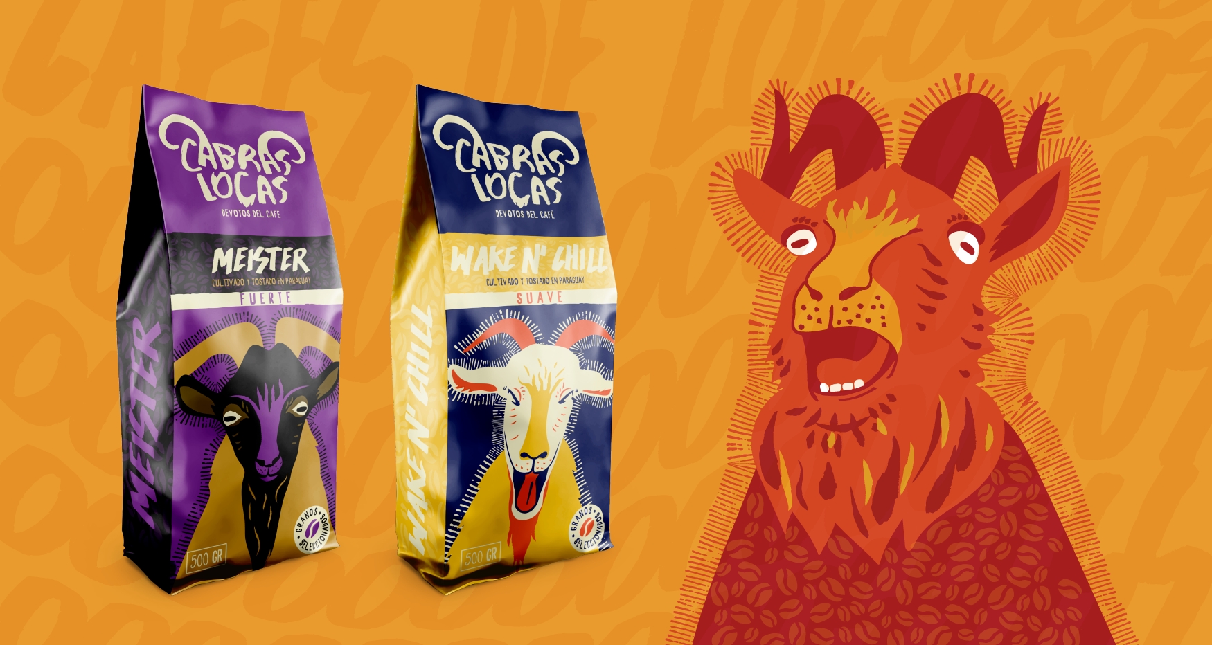
The concept leaned into boldness and irreverence, positioning coffee as energetic, playful, and alive. By creating distinctive characters and a visual language built around expressive goats, the brand achieved immediate recognition and strong emotional connection with consumers.
We began with competitor analysis and consumer research to identify gaps in the coffee sector. Insights revealed a space for a playful, bold identity appealing to younger consumers who value authenticity and standout design.
From there, we built a brand strategy that defined positioning, values, and tone—anchored in devotion to coffee, cultural authenticity, and energetic storytelling.
We created the brand name to embody personality and memorability, balancing cultural relevance with global adaptability. Once the name was defined, we developed the full identity system: logo, typography, color palette, and the expressive goat illustrations that became the brand’s signature.
This stage also included defining messaging pillars, ensuring consistency between the visual and verbal identity.
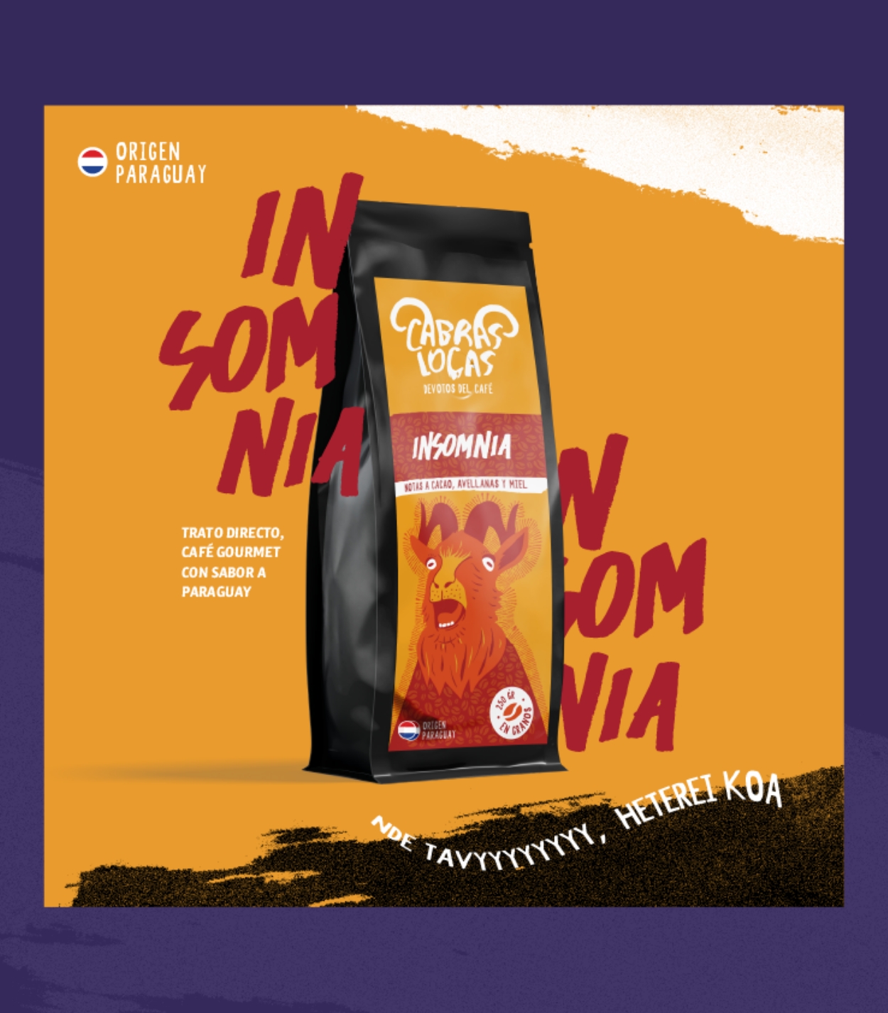
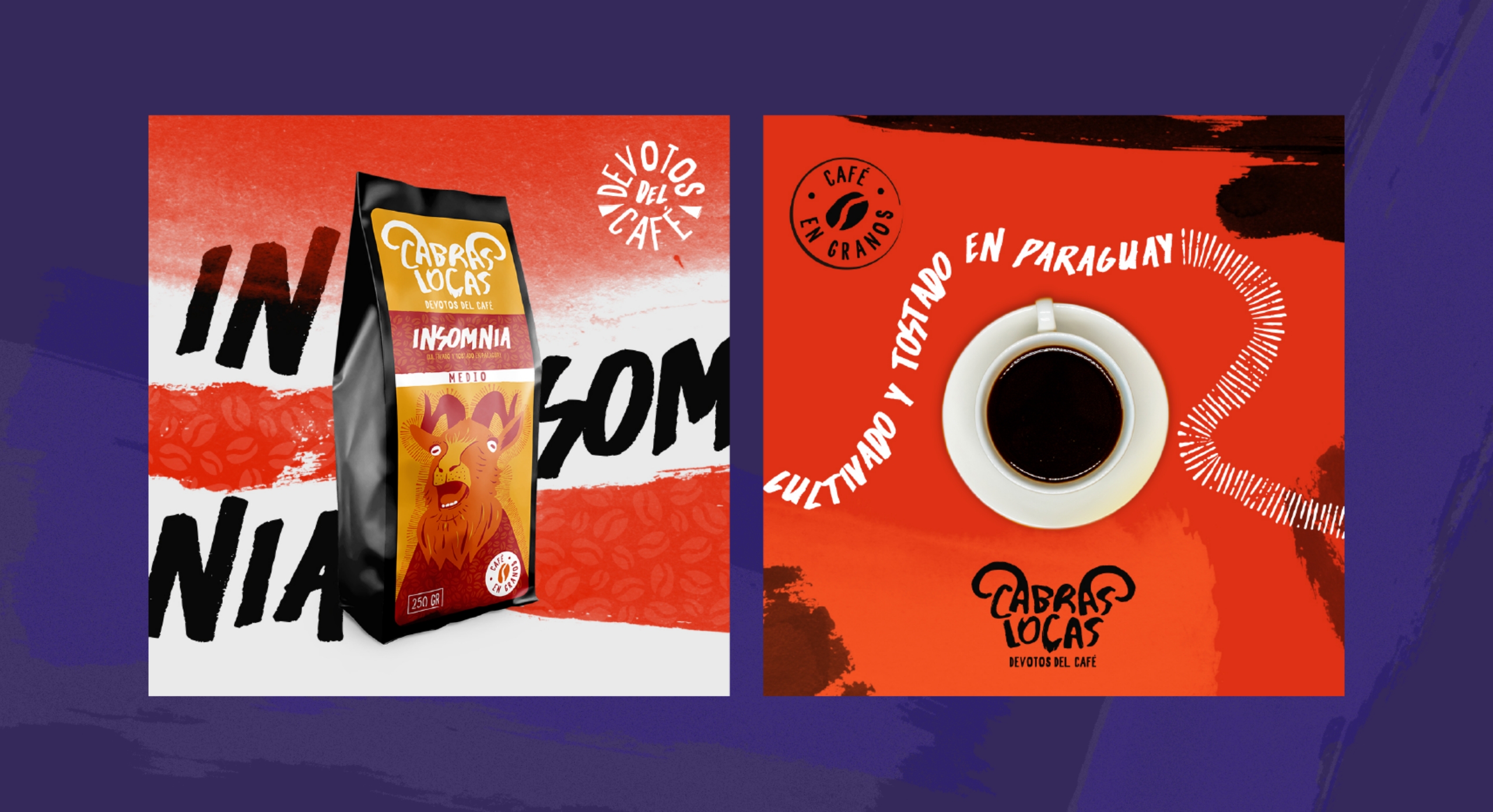
With the identity set, we designed packaging for each coffee blend. Each product line was given its own goat character and bold color scheme, creating strong shelf differentiation while reinforcing overall brand unity.
The packaging design prioritized both storytelling and clarity—making roast levels, flavor notes, and product details accessible while still standing out.
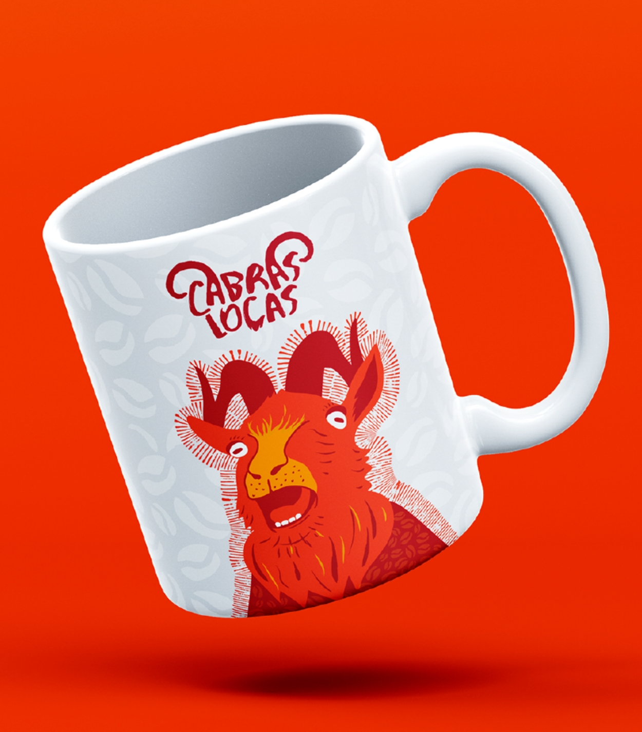
Finally, we extended the brand to merchandise such as mugs, hang tags, and promotional items, all carrying the same bold look. These became both marketing tools and additional sales drivers.
We supported the rollout with social-ready visuals and collateral, ensuring the brand launched consistently across retail and café spaces.
The launch quickly demonstrated the power of combining bold branding with a strong retail presence. Early adoption translated into measurable business growth:
These results validated the strategy: a daring, character-driven identity not only stood out visually but also generated tangible sales, customer excitement, and new distribution opportunities.


We would love to grow with you and bring your vision to life.
Schedule a call